Fire TV Channels
Live Streaming & VOD Experience Design
System Framework
Fire TV’s newest first party app for live and on-demand content needed continuity in it’s brand identity & navigational framework with the parent design system. Set to the task, I grew Fire TV Channels’ core visual experience, reborn under a refined, unified framework.
Timeline
Spring 2023
Role
Lead UX Visual Designer
Overview
The core Fire TV experience is an amalgamation of various streaming partners on a single device. It also offers on-device native apps — Fire TV Channels being the newest as of 2024. Through this service, customers can freely stream thousands of different types of video content, ranging from entertainment and games to travels and cooking. It’s all live, and on-demand.
As one of Fire TV’s first, 1st party apps, a foundational design system needed to be created for development of the product. To tackle this problem, I took on ownership of UX visual design for the Fire TV Channels app in it’s early growth.
Improved the core UX framework through visual component updates, refreshed brand language, and grew the internal design system library.
Shipped
6
Successful release versions
Increased
11.6%
Streaming time on device
Garnered:
$100 mil
In yearly revenue
Problem
A barebones design system, and a missing brand.
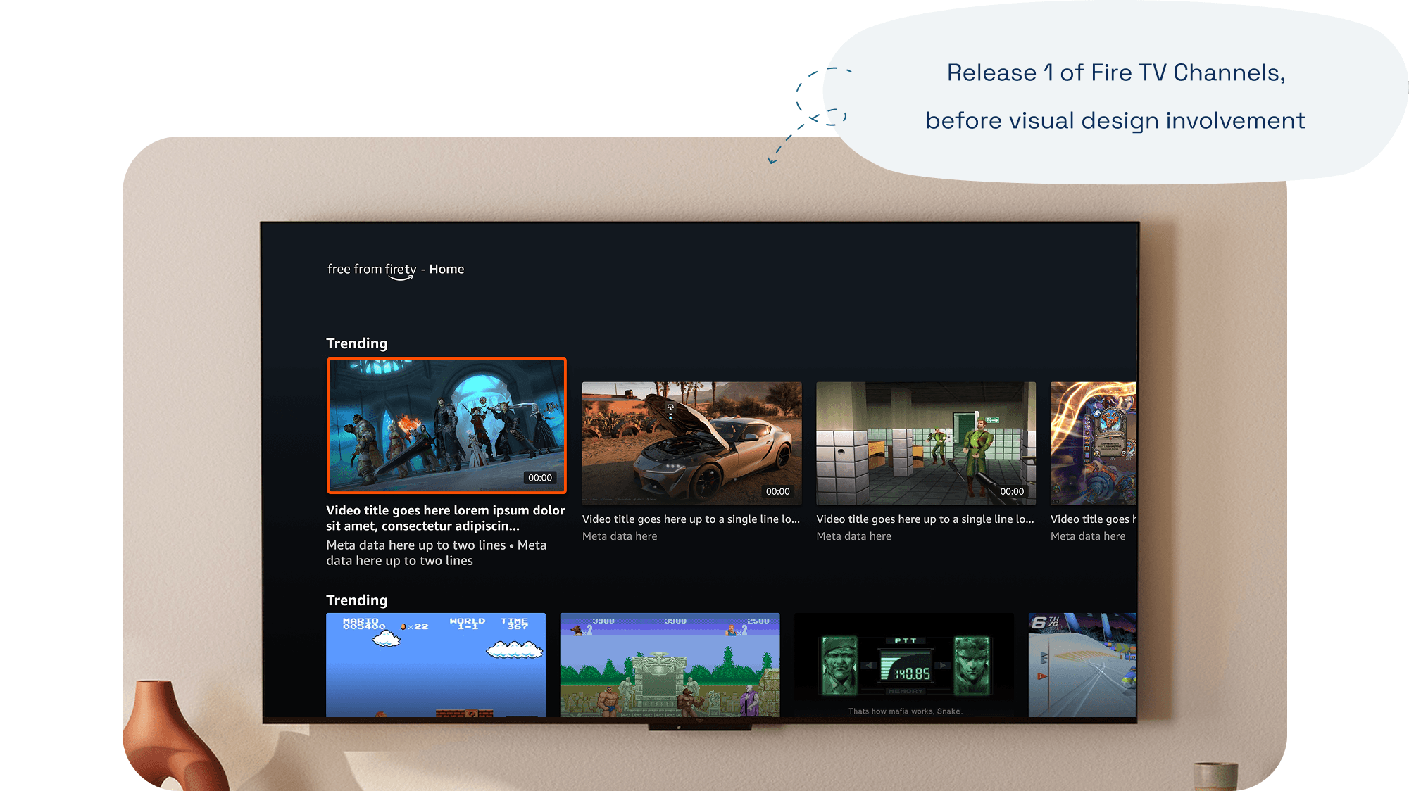
The initial release of Fire TV Channels was pushed out with extremely limited functionality and lacked a clear brand identification. It was first presented as ‘news’, broadcasting only news content and borrowing an outdated gradient from the Fire TV brand.
Within the app, customers were restricted to a lackluster browsing experience that was largely disjointed from the core Fire TV experience — which offered a large canvas of seemingly endless content. Despite being a Fire TV app, even small states like tile focus and playback felt off.
Areas of Impact
Scaling browsing and navigation models.
Over several months, I then designed and delivered final CX patterns for six successful shipped releases of the app — working closely with the single lead interaction designer, and our product partners. I managed visual interaction patterns brought over from Fire TV, and then scaled them from the ground up to develop an entirely new design system library with fully built components and clear documentation for engineering hand off.
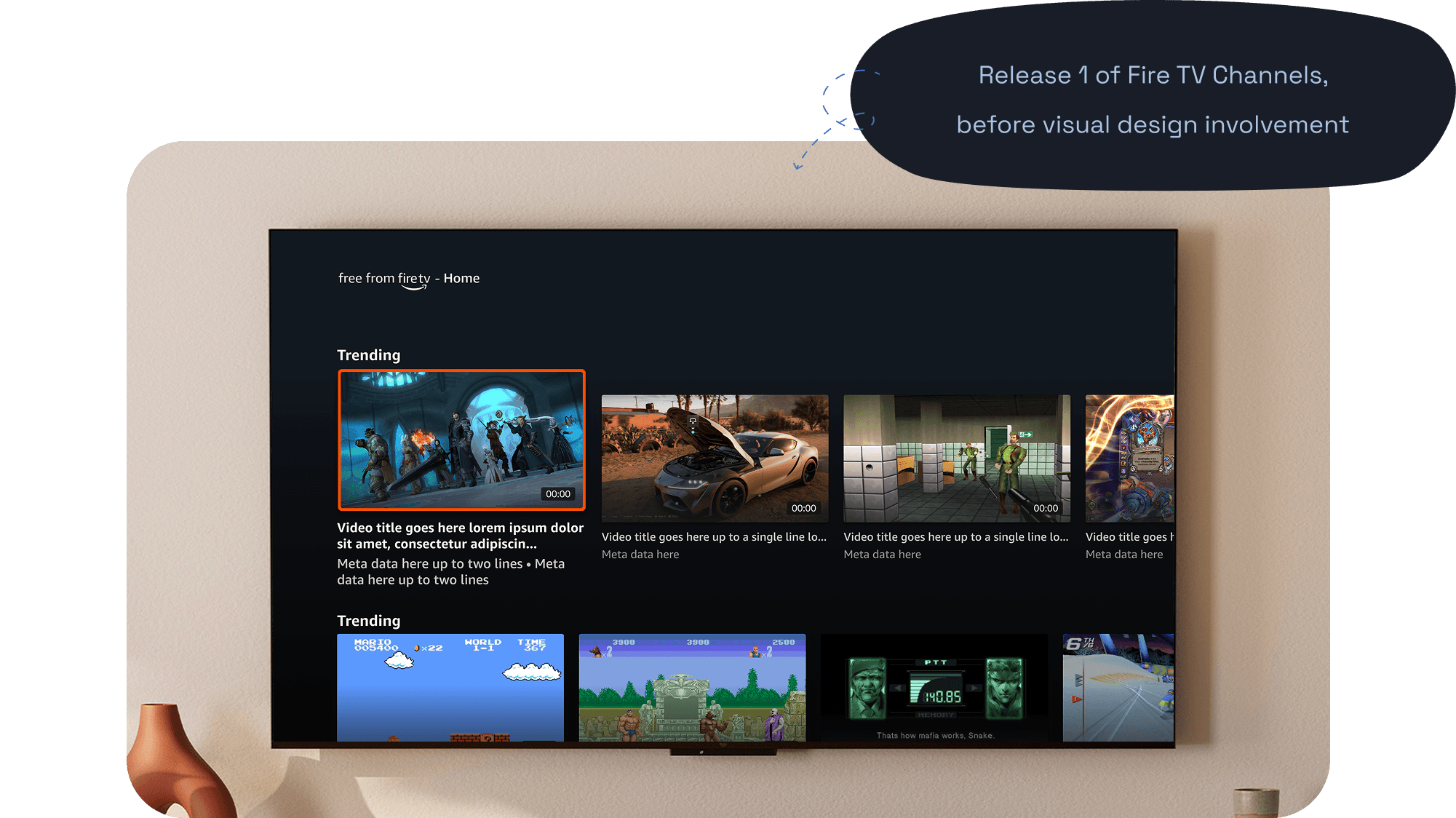
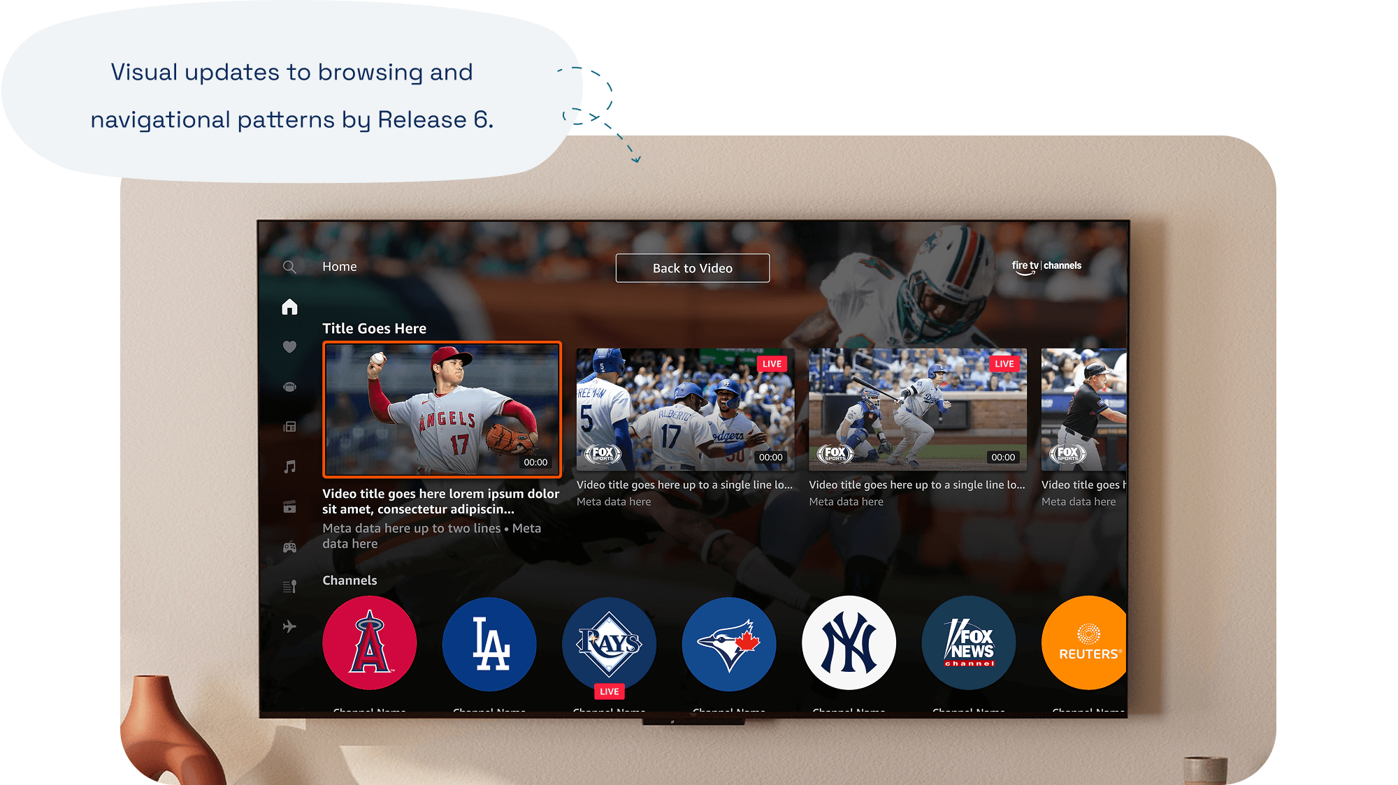
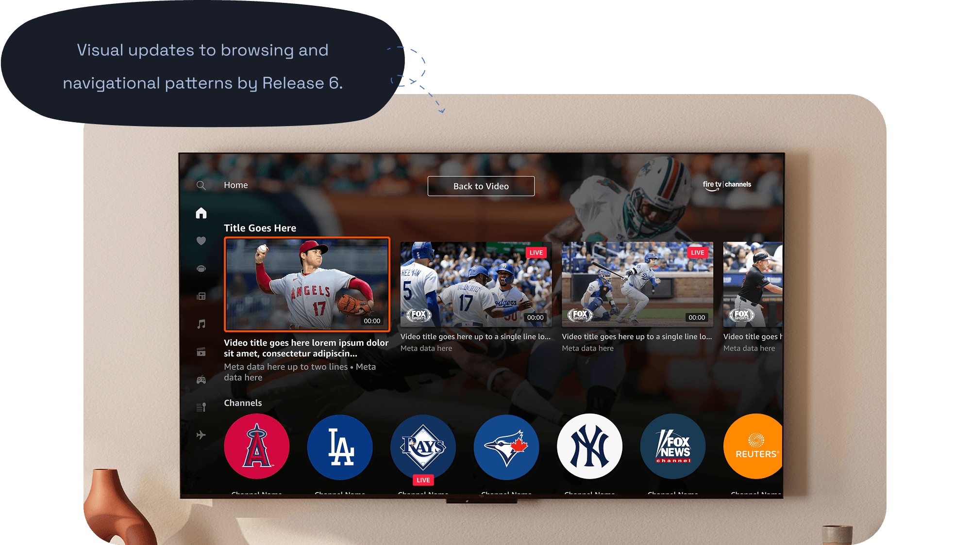
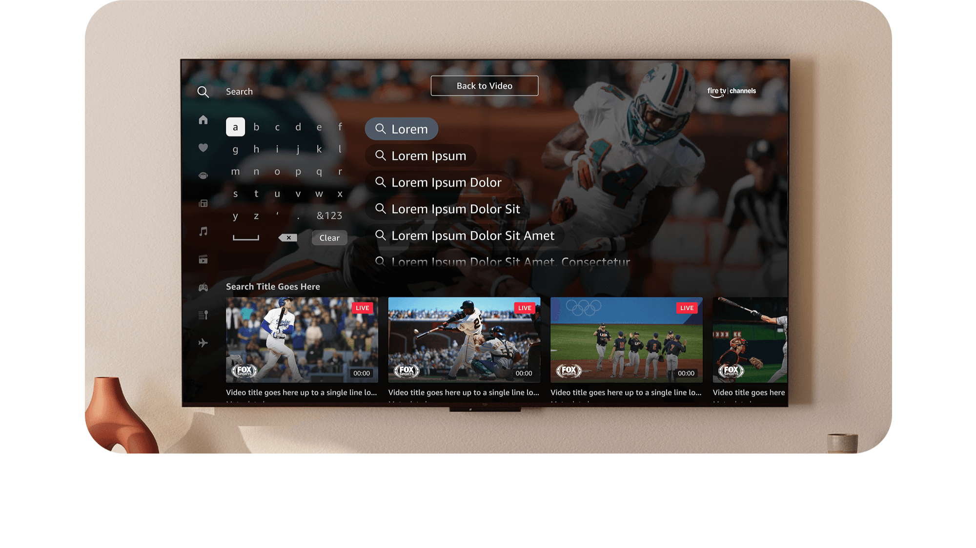
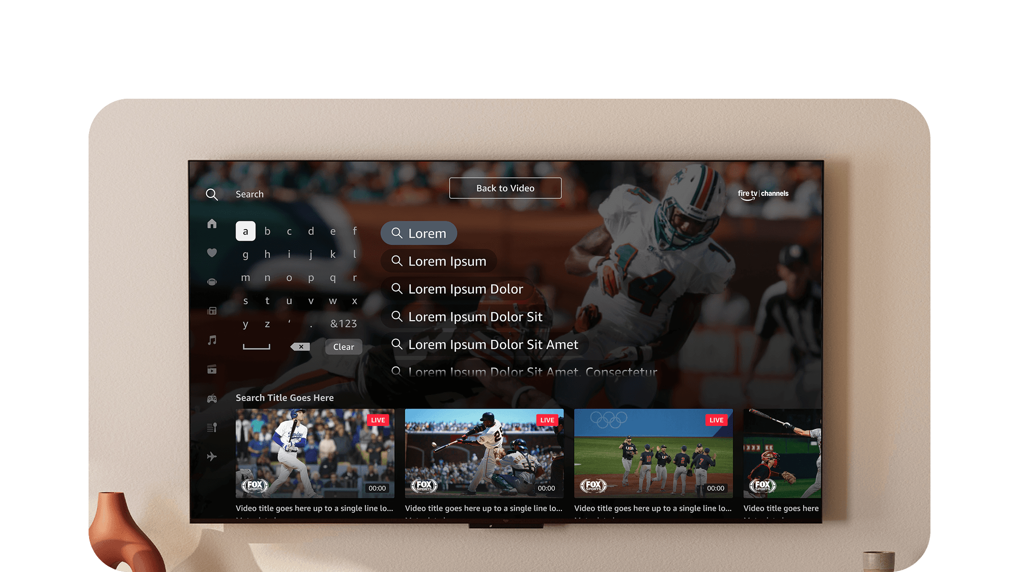
Iterated and developed 4 visual areas: Side Navigation, Browsing, Player Chrome/Playback, and Content Row Placement.
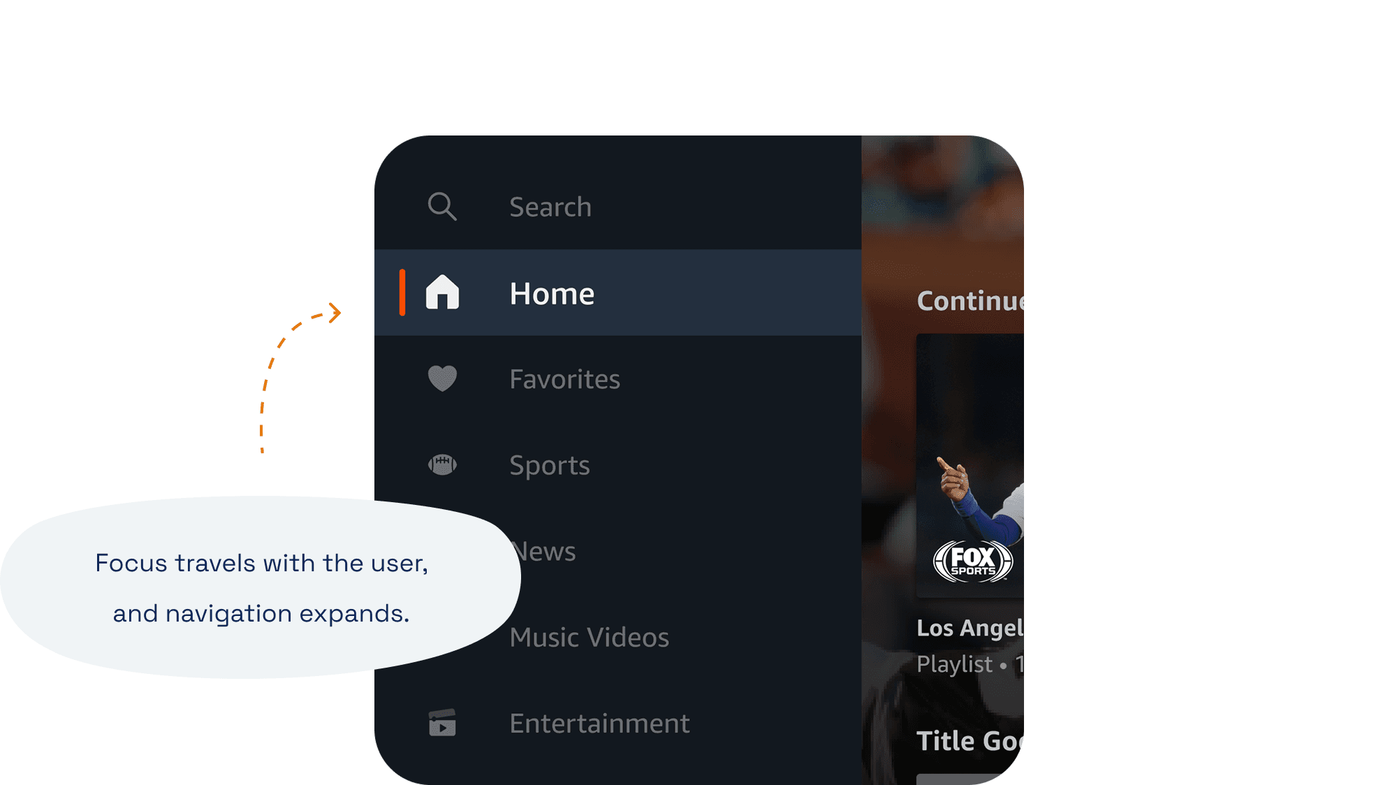
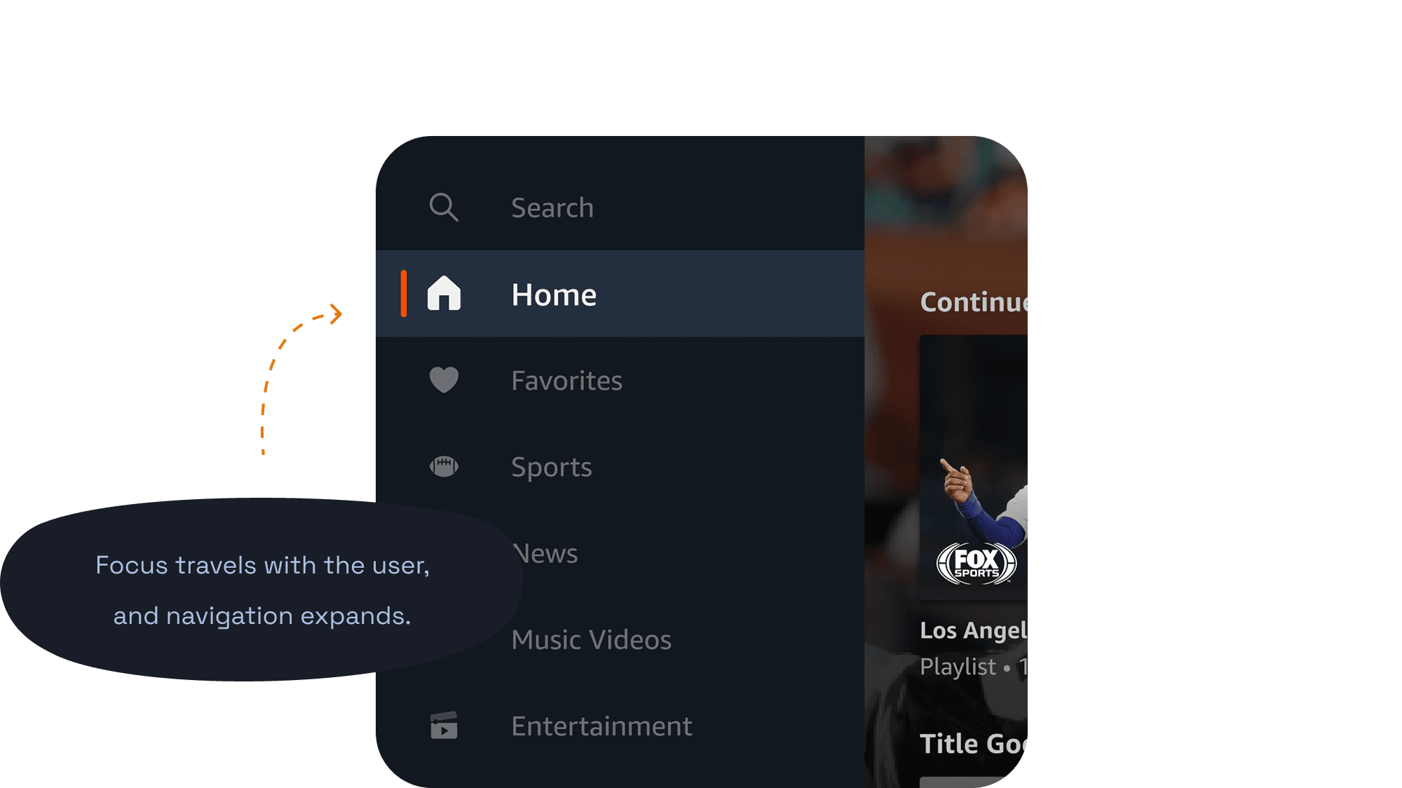
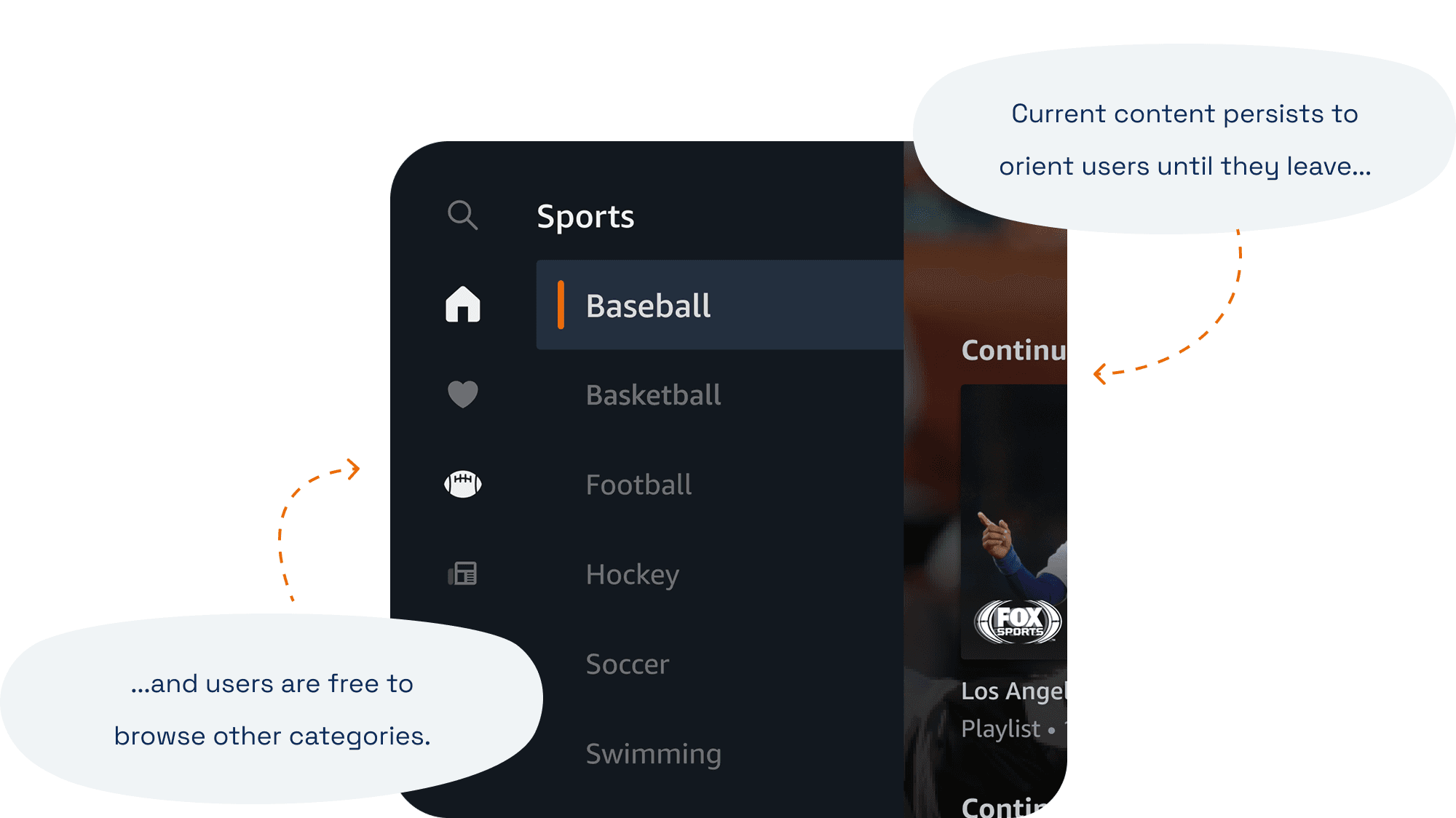
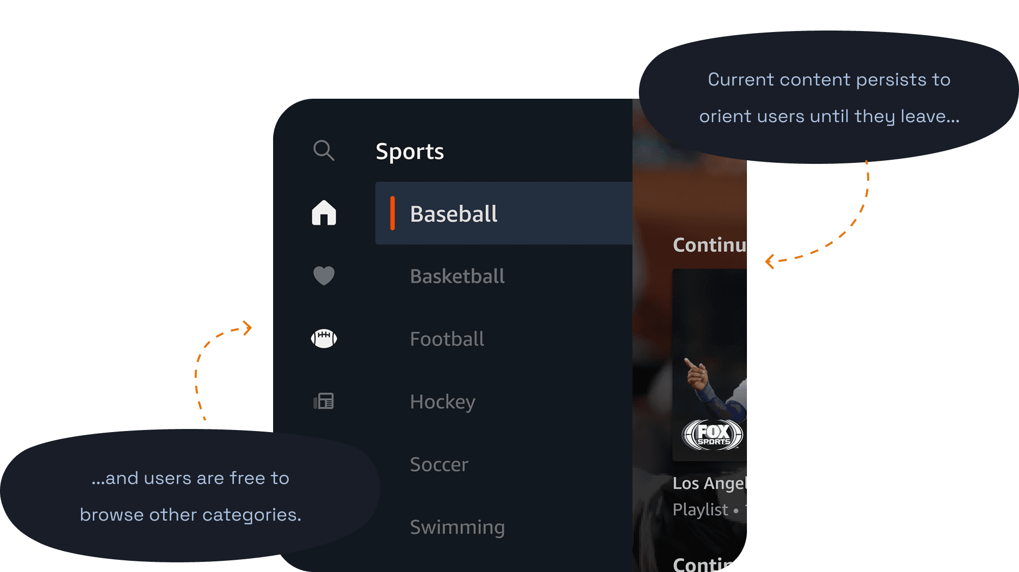
Side navigation gets users where they want, faster.
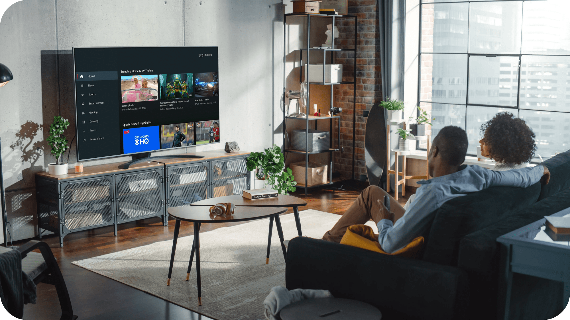
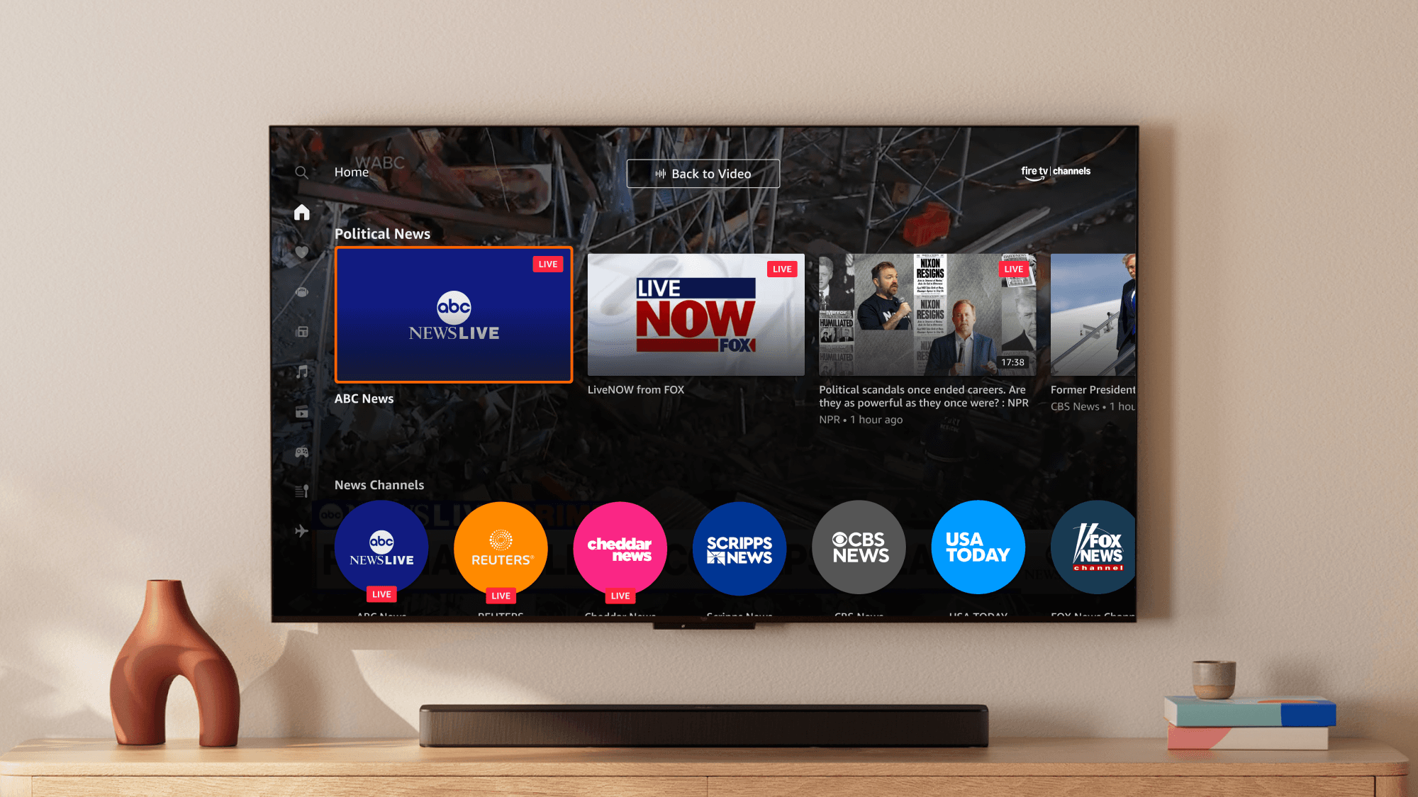
Unlike Fire TV’s centered, horizontal page navigation, I designed a vertical side panel navigation for Fire TV Channels. Customers are able to see all offered categories at a glance. D-padding through content happens more quickly when combined with the horizontal browse row patterns, as customers no longer need to navigate all the way back up a page to flip through other content.
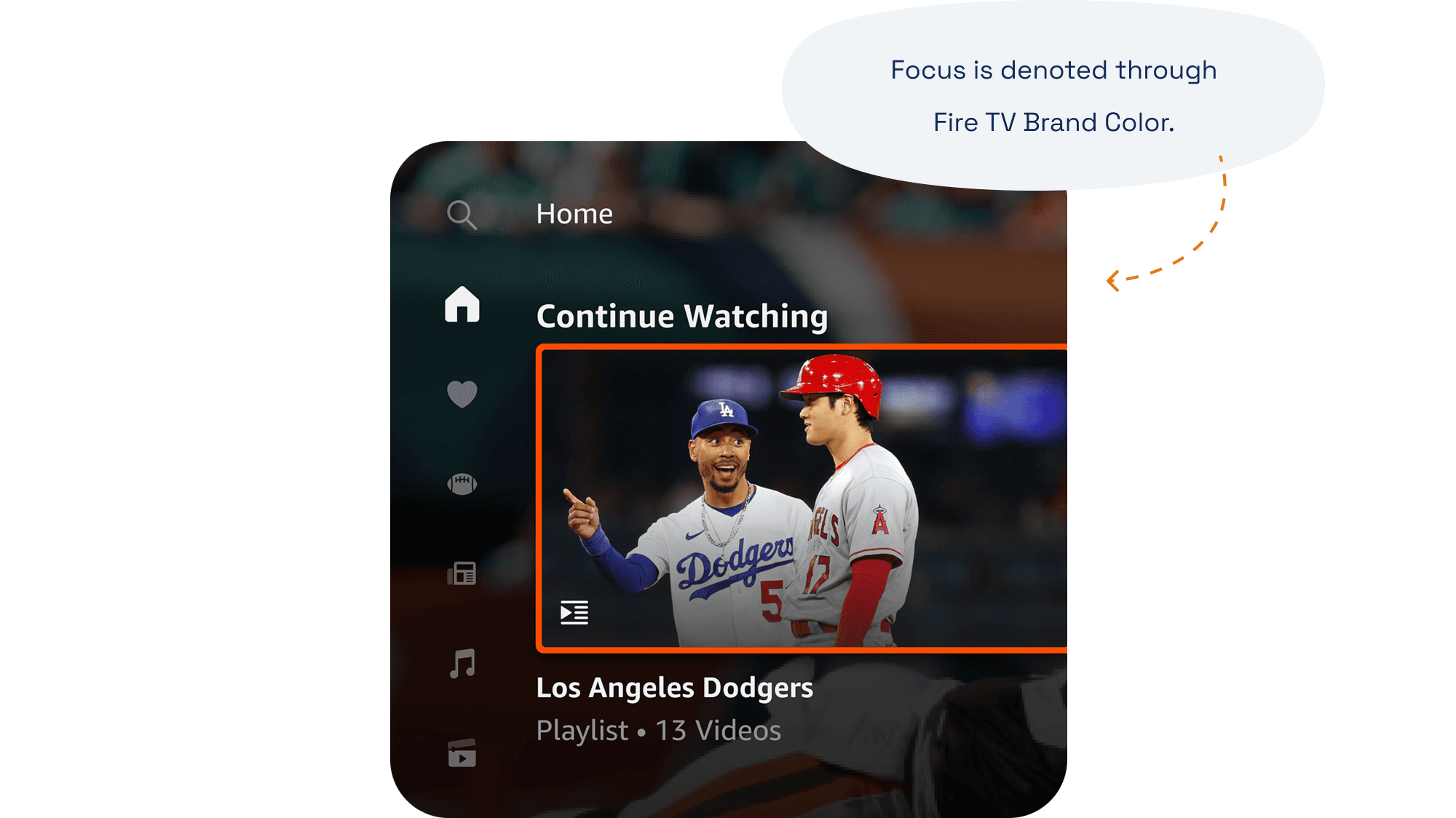
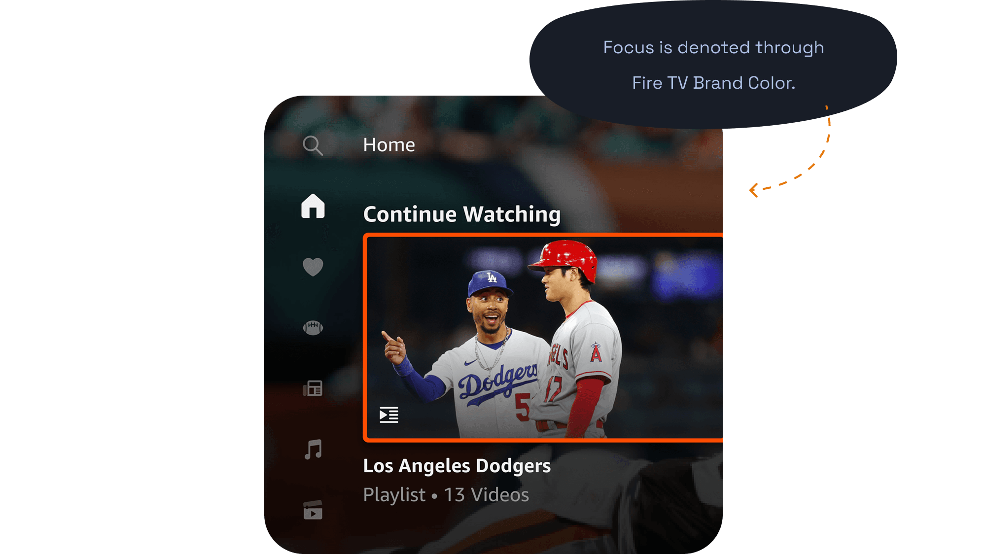
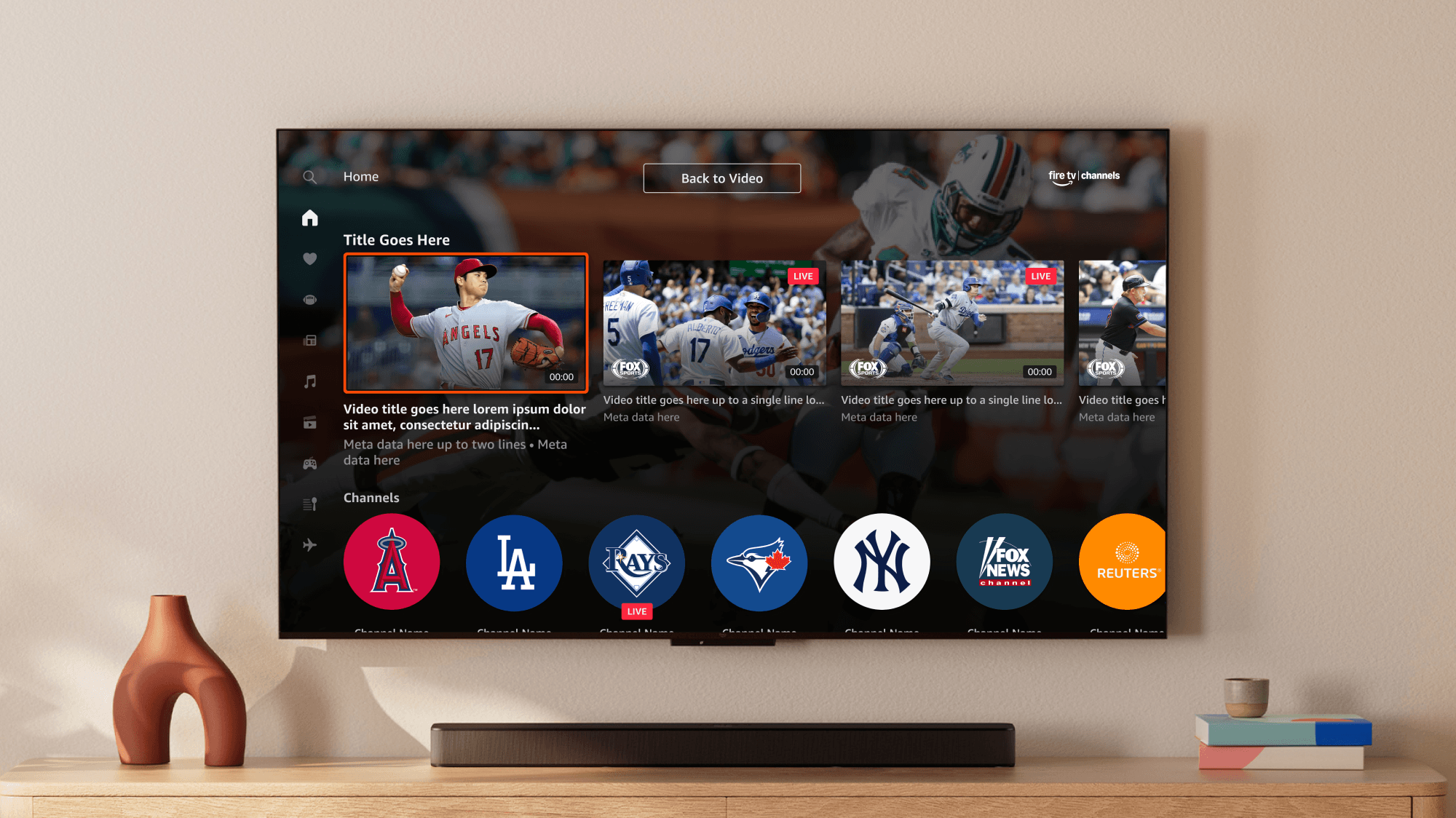
Tile shapes provide easy scanning and give diverse screens.
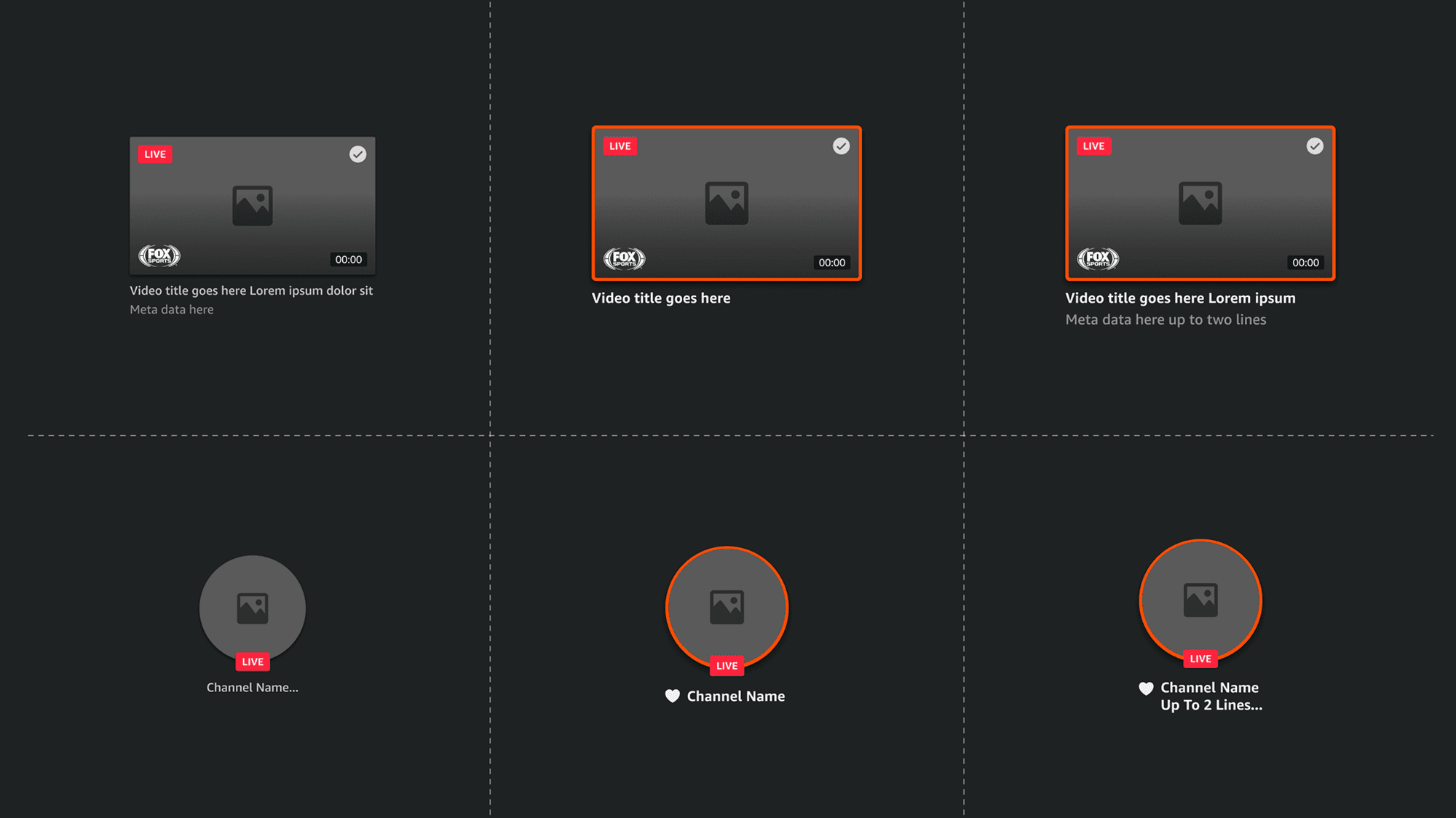
Browsable content includes a combination of videos and channel providers — such as CBS News, ABC News Live, and more. For a more delightful and visually differentiated browsing experience, I designed varied tile types with unique badges. By varying the screen with more than just rectangular tiles of video thumbnails, I lightened content density and optimized navigation speed.
Enabling customers to favorite any form of content also helped personalize the experience and get them back to playback as quickly as possible.
Playback can still be an opportunity for brand and learning.
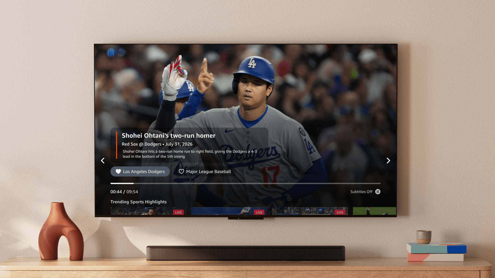
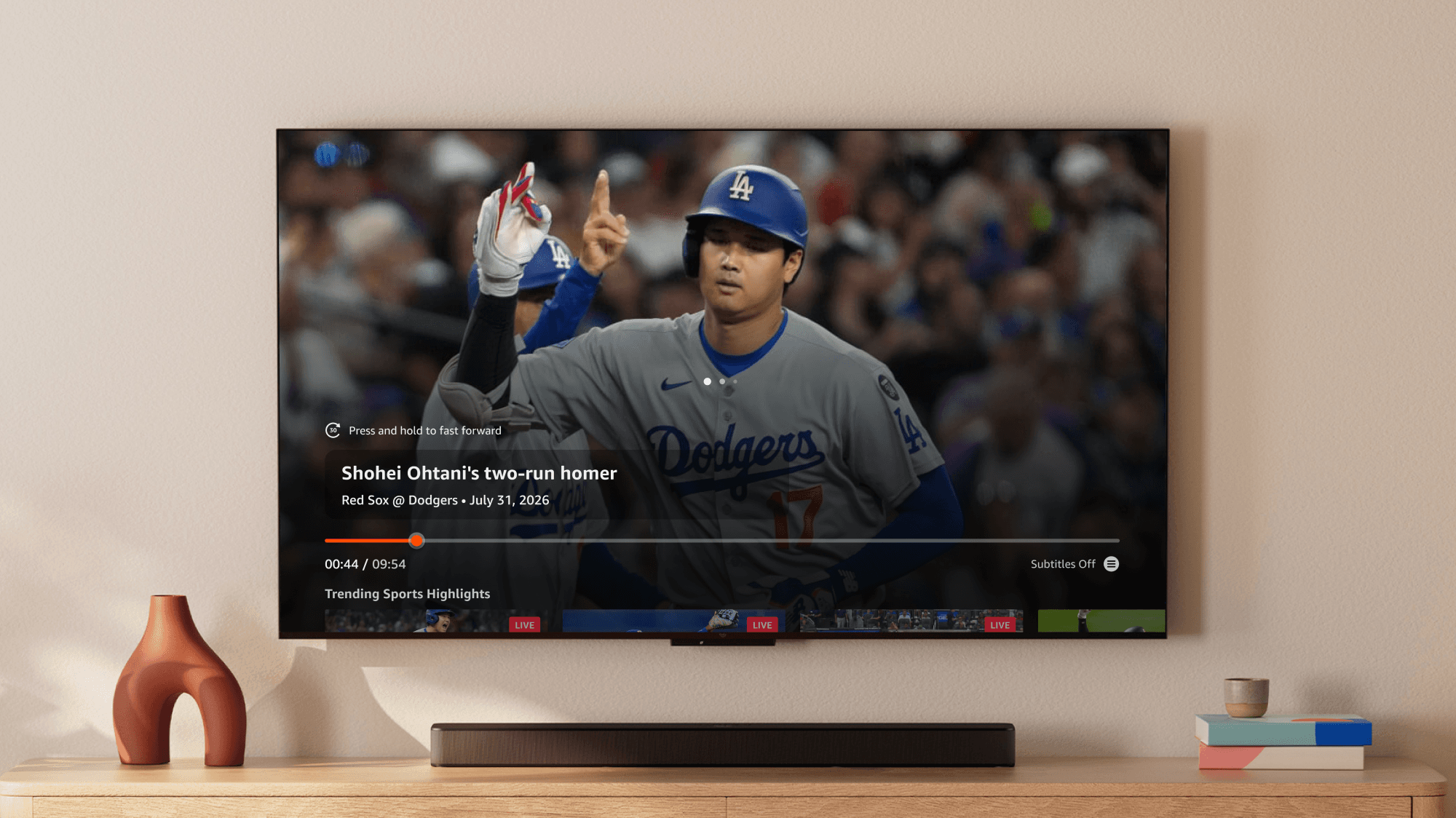
Another unique pattern for Fire TV Channels is where video playback happens. Leveraging brand colors and transparencies, I designed a focus state for each item on the screen to live above live video playback. To teach customers about the various ways they could quickly navigate back and around content, I added remote hints around the UI. The team and I also worked on ways to nest descriptions and maintain a light screen density to avoid content clutter.
Returning customers to content from just 2-clicks away.
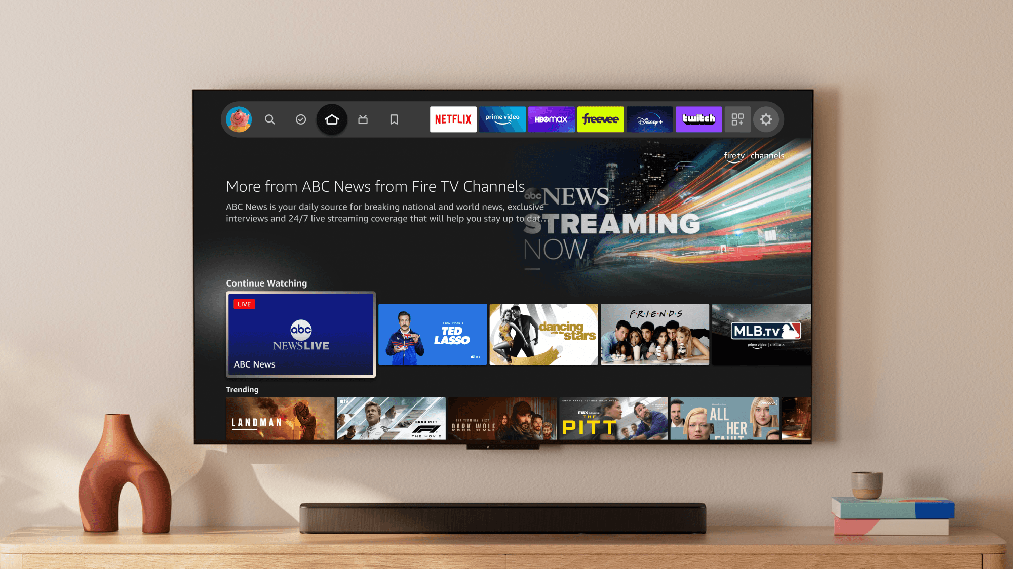
To link both the Fire TV experience and Fire TV Channels experience more closely, I worked to develop special placement in the Fire TV core home UI for continuous video playback where customers last left off. There needed to be a difference between live-based, entity based and non-entity based content.
The end result was specialized product placement in browse rows, consisting of a combination of the Fire TV Channel tiles and uniquely badged video thumbnails. Customers could easily find their way back into the app from 2-clicks away.
Expanding the Brand
A barebones design system, and a missing brand.
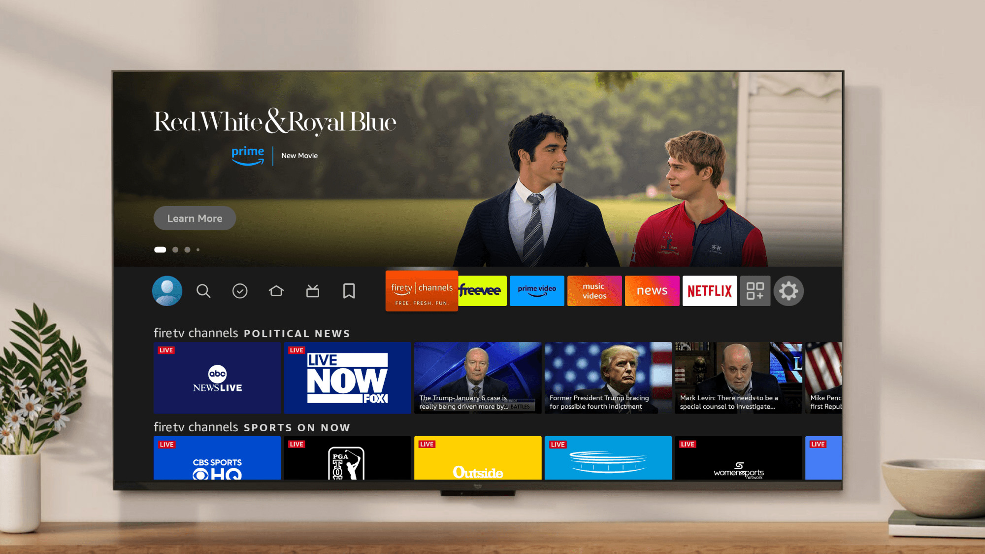
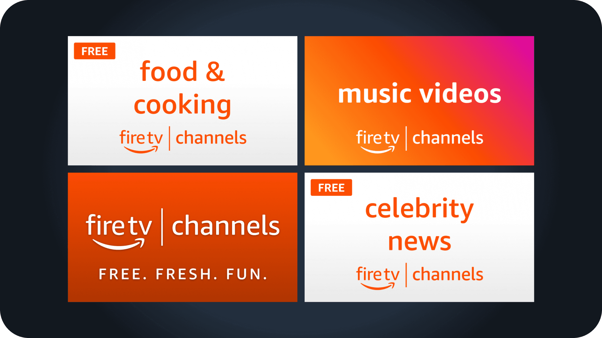
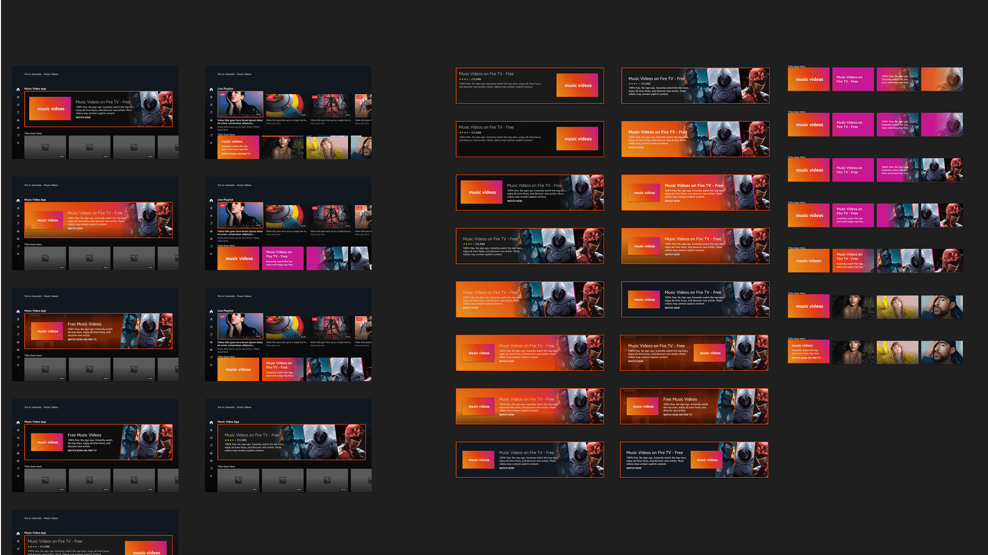
Along with the core UI, I designed Fire TV Channels’ new logo and app tiles assets to be used throughout the UI as brand and ingress moments. I differentiated parent brand versus category tiles using the new fire-y red orange and subtle gradients. These tiles would live in the core Fire TV UI and serve as a strong moment of recognition for the launch.
Designed:
4
Key tile designs
Shipped:
16+
Tiles designs used in UI
Music Provider Collaboration
Weekly partnership with XITE, our music provider.
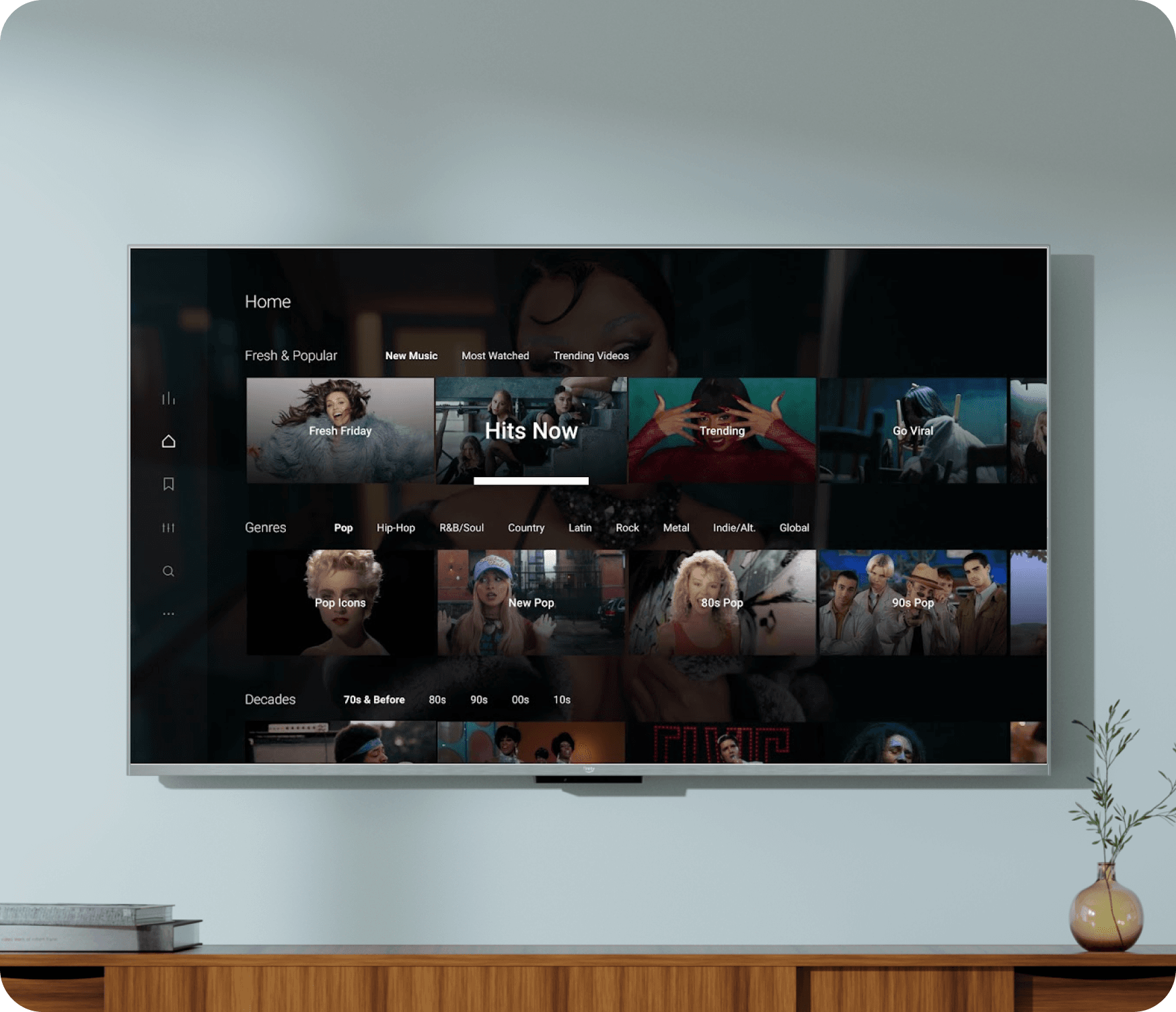
Fire TV Channels launched with XITE to help provide the Music Video portion of the app. As both products were developing in a similar timeframe, there was an ask to align the visuals and navigation as closely to each other as possible — using Fire TV Channels as the framework.
Each week, I collaborated with designers at XITE to provide visual feedback and update them with our on-going design system decisions. This exercise helped me validate my own design solutions, as I could properly see how components and state frameworks were being understood in another product branch.
After Launch: Impact
What happens next?
Since the launch of the revamped Fire TV Channels, it has garnered $100MM+ in yearly revenue, continuing to track a similar goal for the upcoming years. Engagement in the app also continues to climb, with an extra 11.6% increase in session length — an extra 2.5 minutes per session. Customers are continuing to find relevant content to their interests, more seamlessly.
As the numbers increase, so do the opportunities for expansion in collaboration with advertisers and campaigns. In such a fast paced project with so many varying aspects of product ownership, I’m grateful for the challenges that allowed us to deliver a successful app.
Preksha Shukla
Lead UX Designer
Jeremiah Whittaker
My manager ദ്ദി ˉ͈̀꒳ˉ͈́ )✧
Thank you!